a softer, gentler modernism: on alvar & aino aalto
design power couples and the art of living
In 1934, two Finnish architects purchased an empty lot in Helsinki and began building a home. They had met at architecture school, and years later, when Alvar Aalto founded his own practice, he asked Aino Marsio to work with him. He was 26; she was 30. They married the next year and spent their honeymoon in Italy—a trip that doubled as research into Italian vernacular architecture.
Their marriage, which lasted a quarter of a century and ended only with Aino’s death, shaped modern architecture and design. Through projects like the Paimio Sanatorium and Villa Mairea, the Aaltos synthesized Scandinavian architectural traditions with an emerging modernist aesthetic. And they designed at all scales—from the overall structure and layout of these buildings to the furniture, fixtures, and even glassware inside a building. Through Artek, the furniture company they cofounded, the Aaltos turned some of those project-specific designs into mass-produced objects that influenced the Eames, IKEA, and countless others.
Just like their marriage, the empty lot in Helsinki was intended to contain both family and work concerns. And even though the Aaltos later built a separate studio—a 5 minute walk away—their home continued to be a place where Aino prototyped new furniture ideas, and Alvar kept the abstract paintings that, he said, helped him train his intuition during the design process.
Today, the Aalto House is open for visitors, with guided tours available Tuesday through Sunday. When I visited in August, I couldn’t help but feel a sense of reverential awe—even though I dislike cults of celebrity, and I hate how starchitect culture focuses on singular geniuses and ignores their collaborators.
But the awe is still there. It’s because I spent my high school years spent reading Dezeen and designboom, where the name Alvar Aalto was always invoked with respect. I didn’t even know, for many years, exactly why Alvar Aalto was so venerated—I just knew that he was one of those great figures of architectural history. Aino’s name rarely came up, even though her expertise in carpentry and interiors was crucial. Similarly, Elissa Aalto—Ainar’s second wife and an architect as well—was never mentioned. In the late 2000s, the wives of great architects were often treated as simply wives—not collaborators or business partners.
But if I’d known more about Aino and Elissa, it would only have added to the allure around the Aalto name. There are certain cultural ideals attached to the idea of the solitary, singular genius. But if you’re someone who believes in the transformative potential of love—I certainly did at that age, and I still do—then there’s something even more glamorous than the concept of a genius. It’s the concept of a power couple: Two people devoted to each other, and devoted to their work, and often realizing their greatest artistic and intellectual potential because of their love.1
The word Gesamtkunstwerk is often used to describe the Aalto House and other buildings they designed. It’s a work that uses multiple disciplines—like architecture, furniture design, textile design—to produce a coherent, total work of art. And maybe what I’m drawn to, when it comes to couples like the Finnish Alvar and Aino Aalto (or the American midcentury modern designers Charles and Ray Eames), is how the discipline and devotion required of love, and lifelong companionship, can help create a Gesamtkunstwerk.
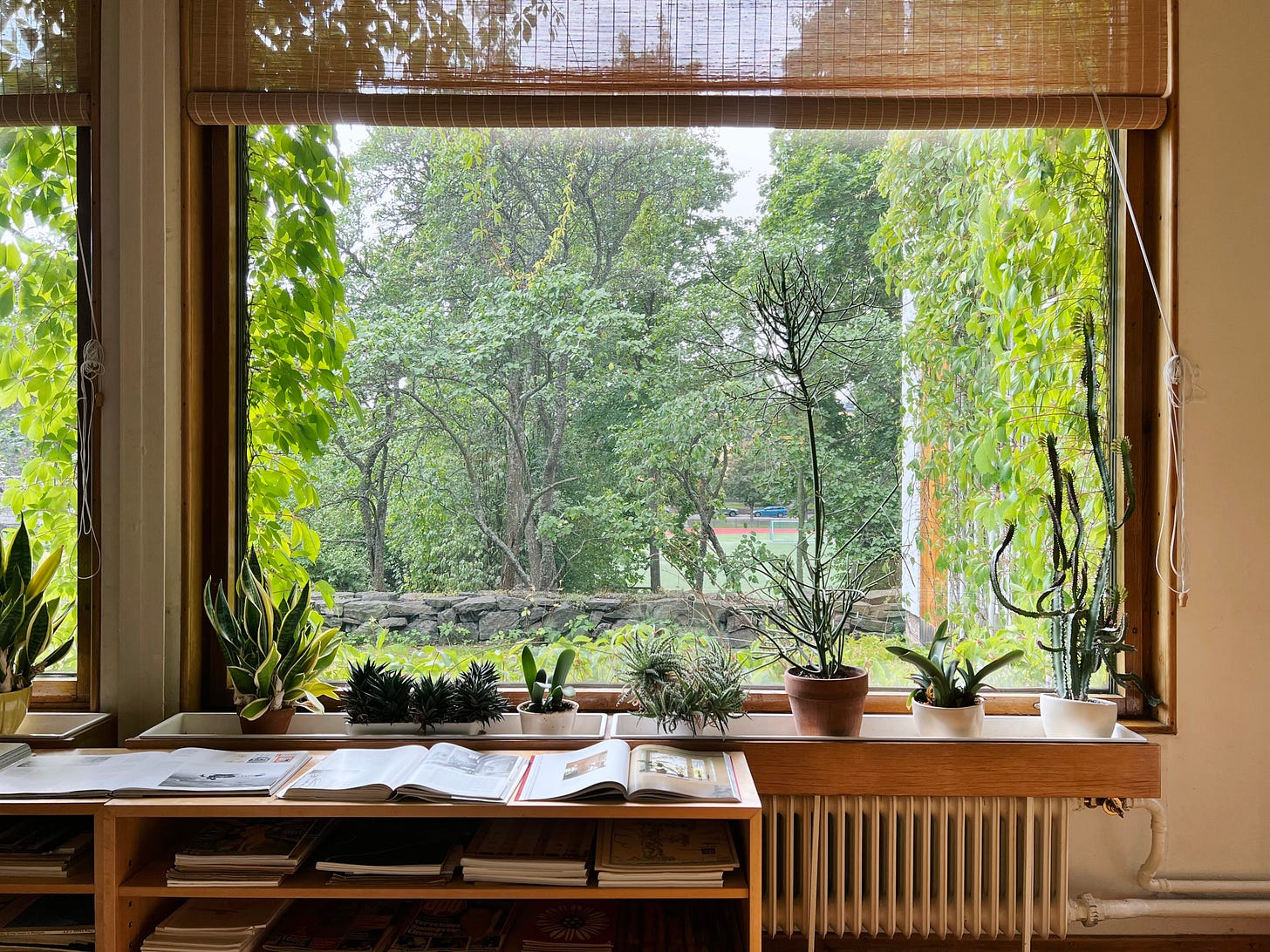
There’s so much to learn from the Aalto House, from the work that Alvar and Aino and Elissa left behind. The tour began in the living room, where our guide drew our attention to the large windows opening into the south-facing garden, which Alvar considered the first room of the house. The living room includes 2 design details from a project the Aaltos finished a few years earlier, the Paimio Sanatorium.
The first detail is the planters near the window, which—our guide explained—were meant to modulate the humidity of the room. In the winter, the air near the windows would be drier—a problem for the Paimio’s tuberculosis patients dealing with respiratory issues. But plants, through the process of transpiration, increase the humidity of the room, softening the dry winter air and making rooms more comfortable. The Aaltos strategically positioned planters around the Paimio Sanatorium’s rooms, and brought that approach into their own home.
The second detail is the door handles that were used in the living room and throughout the house. The handles—now part of the MoMA’s collection—were designed so that the ends of the handles wouldn’t catch on people’s sleeves. This was tremendously useful at Paimio, where doctors and other staff members would rush in and out of rooms, lab coats billowing behind them. With normal door handles, the sleeves might snag on the ends. (And doorknobs are harder to handle in a rush, or for people with dexterity issues—which is why cities like Vancouver have banned them for new buildings.)2
The Paimio Sanatorium, which the Aaltos finished in 1932, laid the foundations for the Aaltos’ distinctive architectural and design approach. Their earlier projects were in the Nordic Classicist style, then the predominant approach for Scandinavian architects. Nordic Classicist buildings were a mixture of Greek and Roman influences (grandiose Neoclassical columns and highly symmetric façades) and vernacular styles common in ordinary Nordic architecture.
But Alvar was intrigued by the modernist approach that Walter Gropius (the founder of the Bauhaus school) and Le Corbusier both advocated for. Today, Alvar Aalto—along with Le Corbusier—is considered one of the most important figures in 20th century architecture, and the Paimio Sanatorium is considered a landmark work in modern architecture.
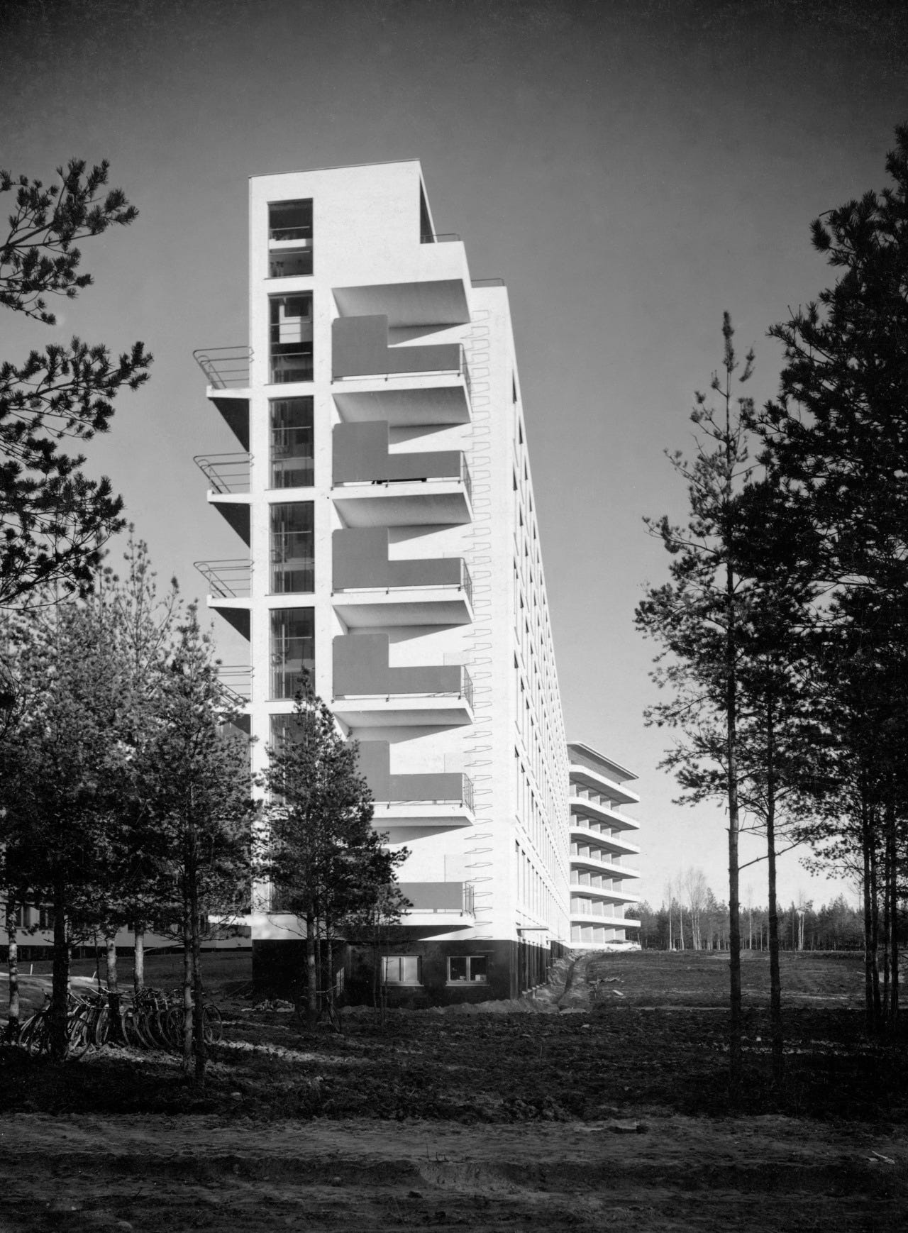
Photos like this—which emphasize the crisp, rectilinear parts of the Paimio Sanatorium’s façade—create the impression of a conventionally austere, pristine modernist project. But other photographs reveal how Alvar and Aino sought to create a welcoming, hospitable environment.

In the early 20th century—before the advent of antibiotics and the BCG vaccine—tuberculosis was one of the deadliest diseases in Europe. Tuberculosis sanatoriums, writes the curator Emily Sargent, “tried to create the ideal circumstances in which to recuperate from the disease.” They were often located in forested areas with plenty of fresh air and sunlight, and patients often stayed for 6 months or more.
The Aaltos designed Paimio so that balconies and windows received as much sunlight as possible. And each room, Alvar said, was designed to be healing and restful for the patient staying there:
The room design is determined by the depleted strength of the patient, reclining in his bed…The color of the ceiling is chosen for quietness, the light sources are outside the patient’s field of vision, the heating is oriented towards the patient’s feet, and the water runs soundlessly from the taps to make sure that no patient disturbs his neighbor.
The Aaltos designed special washbasins that reduced the amount of noise from handwashing—another thoughtful detail that they brought back to the Aalto House. Other details were intended to make the sanatorium easier for staff to clean. The floors curved up to meet the windows, so that dirt wouldn’t collect in the typical corner between floor and wall. Wardrobes were wall-mounted and slightly raised, making it easier to clean the floor.
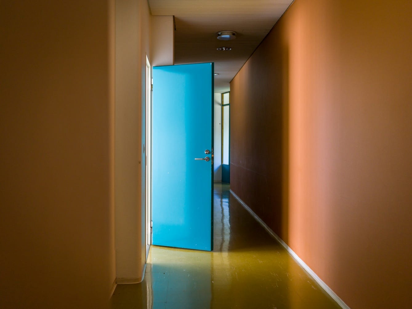

The Aaltos also worked with the artist Eino Kauria to choose the colors for the sanatorium. Some colors were used to help with wayfinding (each ward was given a different color); others were meant to cultivate positive, instinctual associations. As the architecture professor Witold Rybczynski writes,
The ceiling was painted a restful dark green and the linoleum floor was brown. Brighter colors were used in public areas, though not the cloying “cheerful” colors that are common in so many hospitals today. The stairs and hallways were warmed in the cold winters by canary yellow rubber-coated floors; doors were teal green. The windows of the doctors’ wing were shaded by colorful canvas awnings.
By using yellow for the staircases, our guide at the Aalto House told us, the Aaltos created an instinctive feeling of elevation, a gently buoyant mood.
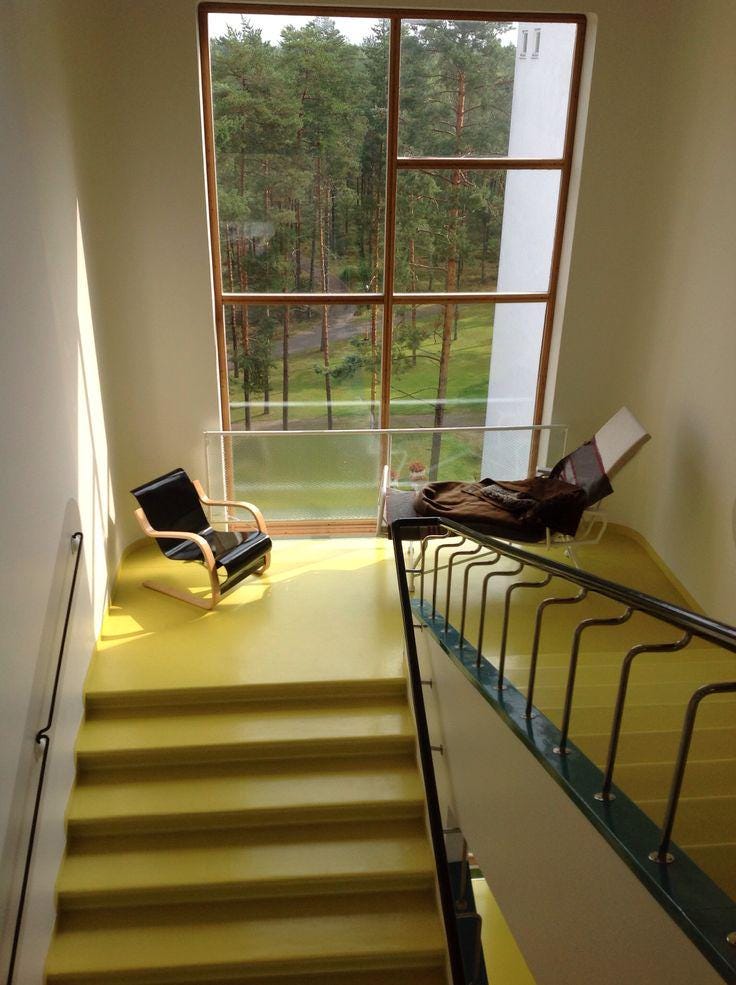
The Aaltos even designed a bent plywood chair that, as Sargent writes, “aimed to provide the optimum angle for respiration. Patients were to recline, breathe deeply and contemplate the reflection of the surrounding forest in the ceiling.” The chair is still manufactured by Artek today, and you can see its influence in furniture designed by Charles and Ray Eames a few decades later, as well as the much more affordable Poäng chair.3

The Aaltos’s “care for the wellbeing of patients,” as the architect and critic Ellis Woodman wrote in 2016, “was imprinted on every last component of these intensely conceived interiors.” The Paimio Sanatorium is an iconic work of modernist architecture, but it departed from the austerity championed by Le Corbusier—and “transcended the brittle architectural doctrines of its period”—to become a building that “radiate[s] a profound sense of human empathy.”
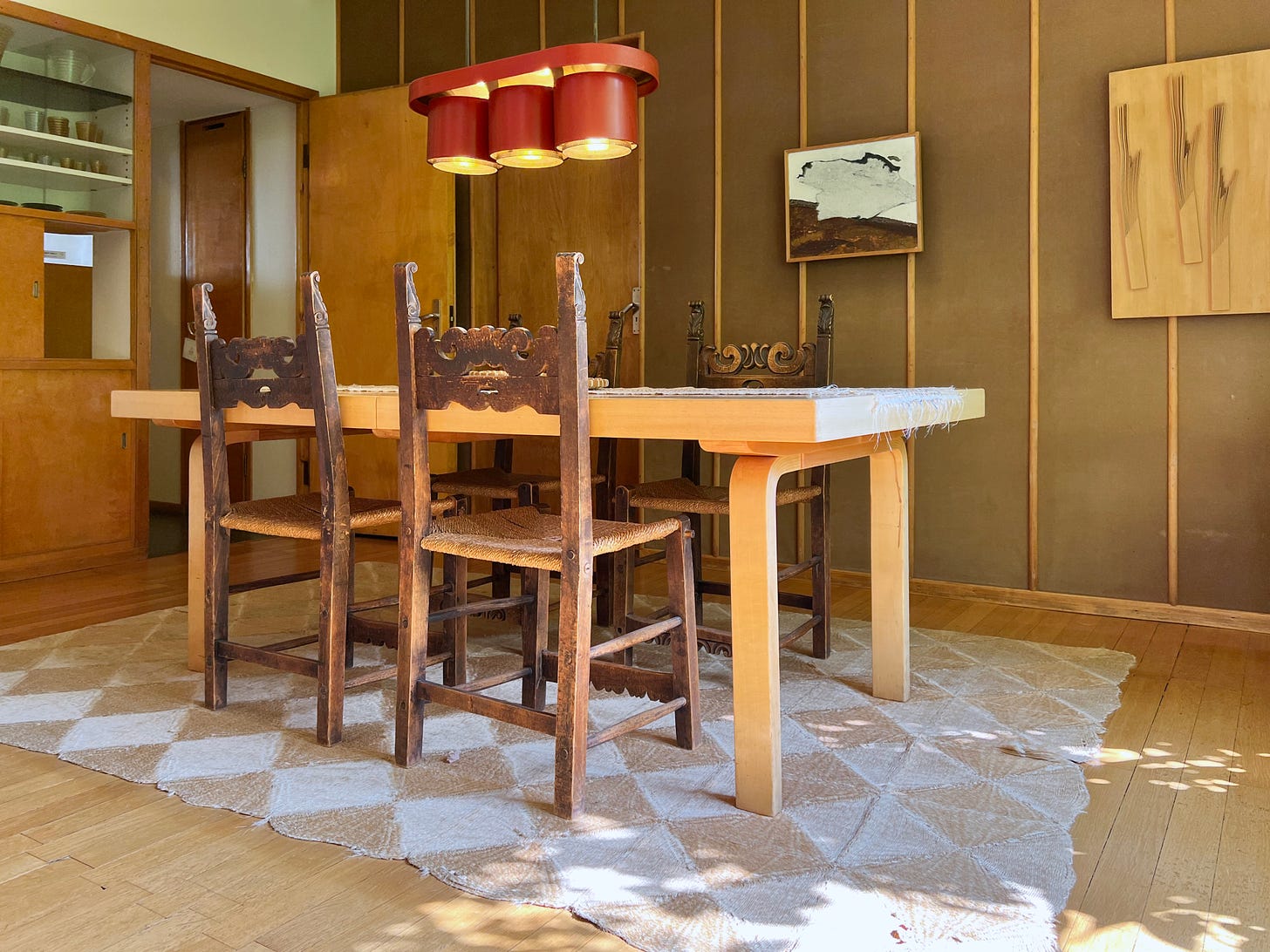
You can see that resistance to architectural doctrine—to a totalizing style that privileges superficial order over human experience—in the Aalto House as well. The dining room of the Aalto House includes four chairs that are strikingly out of place. Unlike the other streamlined, modernist furnishings, these chairs feature a revivalist carved-wood back.
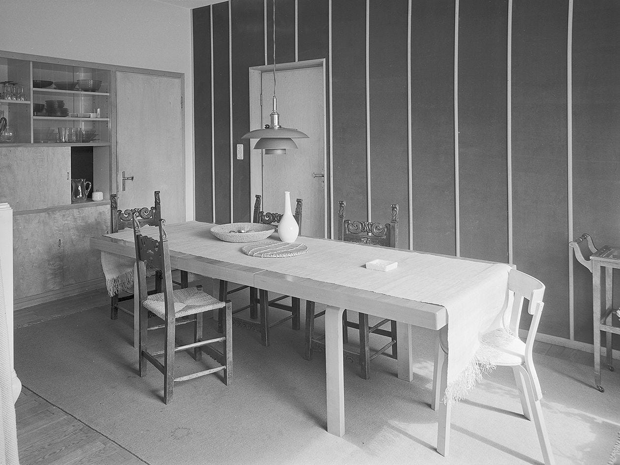
The chairs were purchased by Alvar and Aino Aalto on their honeymoon in Italy, and although at one point they removed the chairs from the room and placed them in storage, they were eventually brought back. “They really weren’t concerned,” our guide said, “with the idea of style.” What mattered most was the personal significance of the chairs, and how they reflected the history of their marriage and their architectural influences.
Two paths for modernist architecture
In the canon of great modern architects, Alvar Aalto is often mentioned alongside the Swiss-French architect Le Corbusier. But although the two were contemporaries and friends—when Alvar married his second wife, Elissa, Le Corbusier gave them a lithograph as a wedding present—their approaches differed significantly.
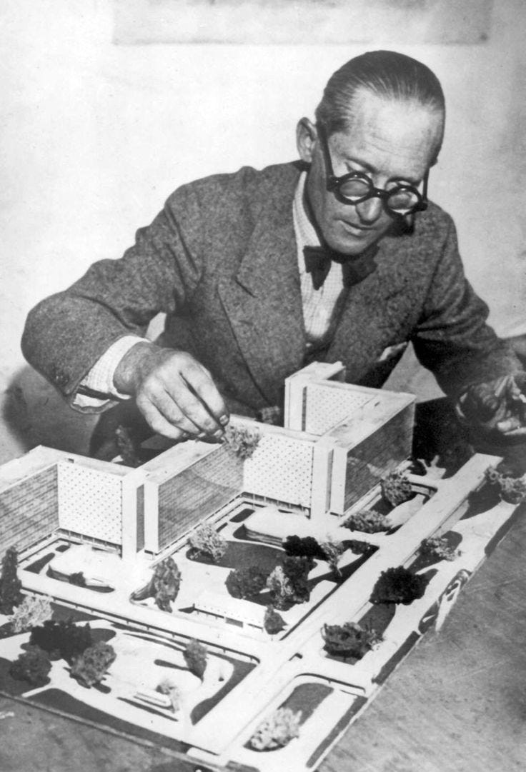
It’s hard to imagine Le Corbusier bringing—and keeping!—a set of sentimental, carved armchairs in his home. He disdained the decorative arts (which Alvar, Aino, and Elissa were so attentive to in their work) and saw handmade work as “the final twitch of the old manual modes, a dying thing” in comparison to the modern surfaces created by mechanical and industrial processes. The ideal home, in Le Corbusier’s eyes, would contain “only standard things created by industry in factories and mass-produced, objects truly of the style of today.”
Le Corbusier’s absolutist approach wasn’t just confined to domestic spaces. As James C. Scott, the late American political scientist and anthropologist, wrote in Seeing Like a State, Le Corbusier had an “Olympian ruthlessness” when it came to urban planning. He sought to eradicate the past and force people to comply with his new, high modernist, forcefully rational plan for living. He often proposed redesigns for existing neighborhoods—including those in Paris, France and Buenos Aires, Argentina—that subtracted all the cultural and historical specificity about the cities, in favor of a streamlined, industrialized ideal. Paris’s existing street layout was, to Le Corbusier, “a vision of Dante’s Inferno.” In the Plan Voisin, Le Corbusier suggested that the city bulldoze large swaths of the right bank’s existing buildings and replace them with 18 identical, evenly spaced high-rises, in order to turn Paris into an “organized, serene, forceful, airy, ordered entity.”
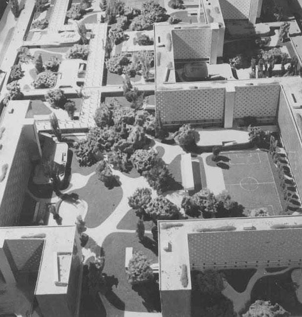
“Le Corbusier’s plans,” Scott observes, “were self-consciously immodest”:
No compromise is made with the preexisting city; the new cityscape completely supplants its predecessor…None of the plans makes any reference to the urban history, traditions, or aesthetic tastes of the place in which it is to be located. The cities depicted, however striking, betray no context; in their neutrality, they could be anywhere at all.
Le Corbusier’s approach to modernism was centered around an uncompromising dedication to what he called “sublime straight lines.” It was a commitment to a rigid form of aesthetic rationality that was, in reality, highly irrational. As Scott notes,
As a practical matter…a straight line was often impractical and ruinously expensive. Where the topography was irregular, building a straight, flat avenue without daunting climbs and descents would require great feats of digging and leveling. Le Corbusier's kind of geometry was rarely cost effective.
The terror of theory and learning what “critical regionalism” actually means
Towards the end of my visit to the Aalto House, I had a brief conversation with the tour guide—an architect and historian—on Aalto’s influence on late 20th century and 21st century architecture. The guide referenced the British architect and critic Kenneth Frampton’s critical regionalism—one of those concepts that I had encountered years ago but had never gotten around to understanding.
Critical regionalism is one of those obscure, inscrutable -isms that terrified me when I first started reading about architectural history and theory. Every discipline has these terms that show up constantly and are usually invoked without explanation—as if you’re meant to know them already, or pretend that you do. For the intellectually insecure (me, for much of my life, and maybe even now), coming across these terms always makes me feel like I’m being chastised. You don’t know what this means—why don’t you know? What are you even doing here? It often takes some particular interaction—with a person, or with an exceptionally accessible text—that makes me realize that I can just, you know, figure out what the term means instead of fearing it for the rest of my life.4
It turns out that Frampton’s “Towards a Critical Regionalism: Six Points for an Architecture of Resistance,” first published in 1983, echoes James C. Scott’s critiques of modernism. Although Frampton doesn’t mention Le Corbusier by name, the following passage could easily be applied to the architect’s approach:
It is self-evident that the tabula rasa tendency of modernization favors the optimum use of earth-moving equipment inasmuch as a totally flat datum is regarded as the most economic matrix upon which to predicate the rationalization of construction…The bulldozing of an irregular topography into a flat site is clearly a technocratic gesture which aspires to a condition of absolute placelessness.
This is convoluted prose—more so, I think, than the unswervingly direct quality of Scott’s writing. But they are discussing the same tendency to erase the environmental and regional and cultural complexity of physical space—in favor of an arbitrary aesthetic neutrality.
What Frampton argues, in his essay, is that this modernist tendency must be resisted. But the right form of resistance, Frampton writes, needs to “distance…itself equally from the Enlightenment myth of progress and from a reactionary, unrealistic impulse to return to the architectonic forms of the preindustrial past.” Frampton doesn’t believe in wholly rejecting the past, as Le Corbusier did—but he’s also not a retvrn to tradition guy. There’s an “ever-present tendency,” Frampton writes, “to regress into nostalgic historicism,” and that tendency is also a dead end for architecture.
Where, then, should architecture go instead? Frampton cites Alvar Aalto’s work, among others, as an example of critical regionalism. Regionalism, as Frampton uses it, incorporates aesthetic and material elements drawn “from the peculiarities of a particular place.” It understands that Finnish architecture might be different from Indonesian architecture, due to the climate and available materials and vernacular styles.5 And insists that buildings are placed in a particular culture and climate—they can’t be, and shouldn’t try to be, universal buildings that can be placed anywhere in the world. But the critical part is a reminder that architects must retain a “critical self-consciousness,” to avoid getting caught up in nationalistic and essentializing ideas of architectural style.

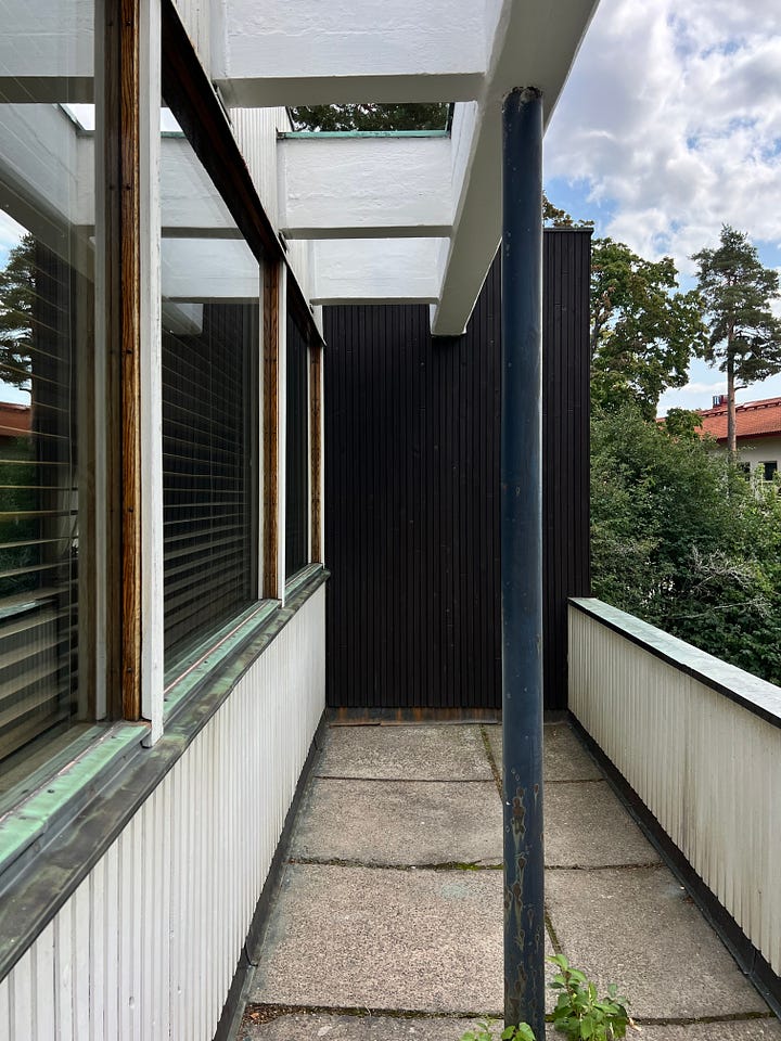
The Aalto House includes several details that are particularly informed by Scandinavian architecture. The exterior of the home used whitewashed wood—instead of the concrete favored by many modern architects—and blackened wood that had been treated with a traditional mixture of boiled tree sap, which helped weatherproof the exterior. (This approach was widely used in Scandinavia and other parts of Europe.)
And the rectangular roof beams, with cylindrical supports running across them, recalled the Swedish villas that were common in Finland. Finland was controlled by Sweden from 1249–1809, and Swedish architecture had a correspondingly significant influence on the country, even after independence.
Architecture is meant to be touched
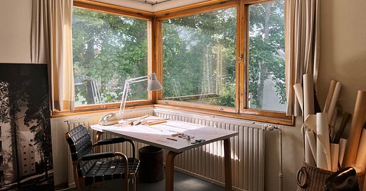
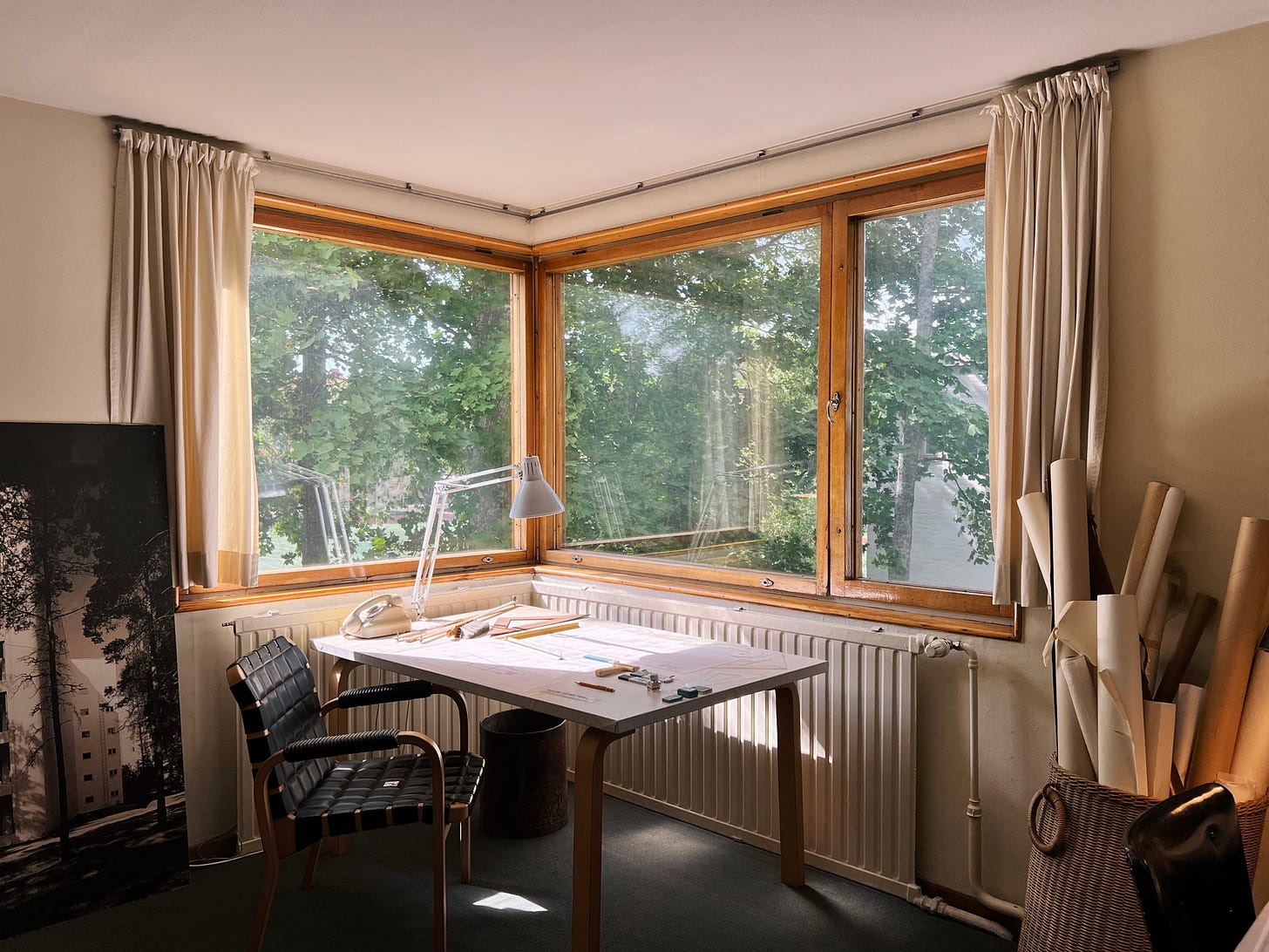
These exterior details make the Aalto House a rewardingly tactile building. I love buildings that use wooden slats as cladding—the building feels warmer, humbler, more integrated with the natural world. And many of the choices that Alvar and Aino made in the interior are equally lovely.
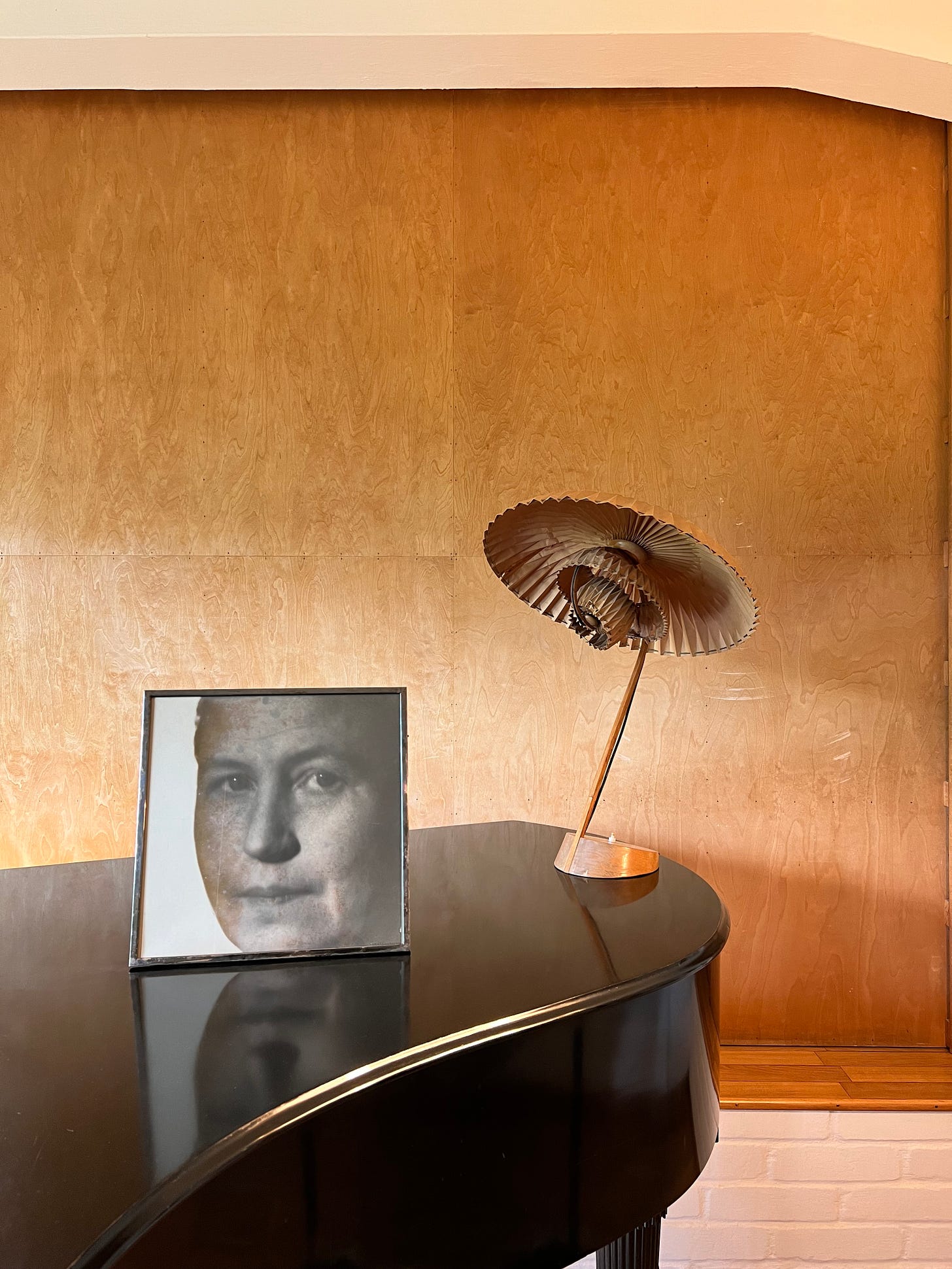
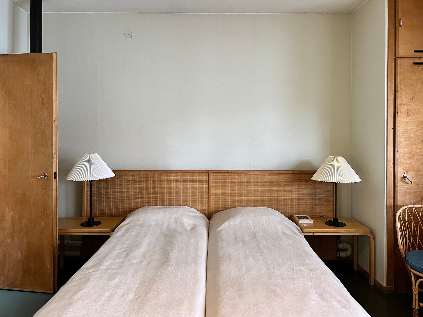
The bedroom, for example, has a woven headboard and two lamps with crisply pleated shades. The door to the walk-in closet (left), as well as the fronts of the built-in shelving (right), are made of a pleasingly textured wood. The textures and colors involved defy the stereotype of an aloof, cold, inhumane modernism. It just feels cozy—like a room you’d actually want to linger in.
These details reflect another principle that Frampton discusses in “Towards a Critical Regionalism.” Modernism, he laments, gives greater priority to sight than the other senses—and even, in many cases, sees sight as the only sense worth accommodating. In a characteristically clunky sentence, he writes: “It is symptomatic of the priority given to sight that we find it necessary to remind ourselves that the tactile is an important dimension in the perception of built form.”
We touch buildings—we open doors with our hands, we walk from tiled floors to hardwood to carpet with our feet. Our skin feels what it’s like to shift from a shaded alcove and into the direct light from a window. The Italian director Lichino Visconti, Frampton writes,
was well aware of these factors when making the film The Damned, for he insisted that the main set of the Altona mansion should be paved in real wooden parquet. It was his belief that without a solid floor underfoot the actors would be incapable of assuming appropriate and convincing postures.”
Western modernism’s “tendency to interpret the environment in exclusively perspectival terms,” Frampton writes, required a “conscious suppression of the senses of smell, hearing and taste, and a consequent distancing from a more direct experience of the environment.” Through critical regionalism, architects could “counter this loss” of intimacy with the environment and design more satisfying sensory experiences.
The poet and memoirist Mary Karr might describe this as the carnal experience of the world—which, for Karr, isn’t about sex but the senses. “By carnal,” she writes in The Art of Memoir, “I mean, Can you apprehend it through the five senses?” Great writing, Karr insists, involves “smell and taste and touch as well as image and noise.” The Aaltos would have felt the same way about great buildings, given their use of pine wood (with its distinctive scent), varied textures, carefully considered colors, and techniques to dampen sound (like moleskine wall panels in the dining room).6 And many of their smaller design objects—like the cabinets and glassware designed by Aino—reflect a sensitivity to texture and sensation.
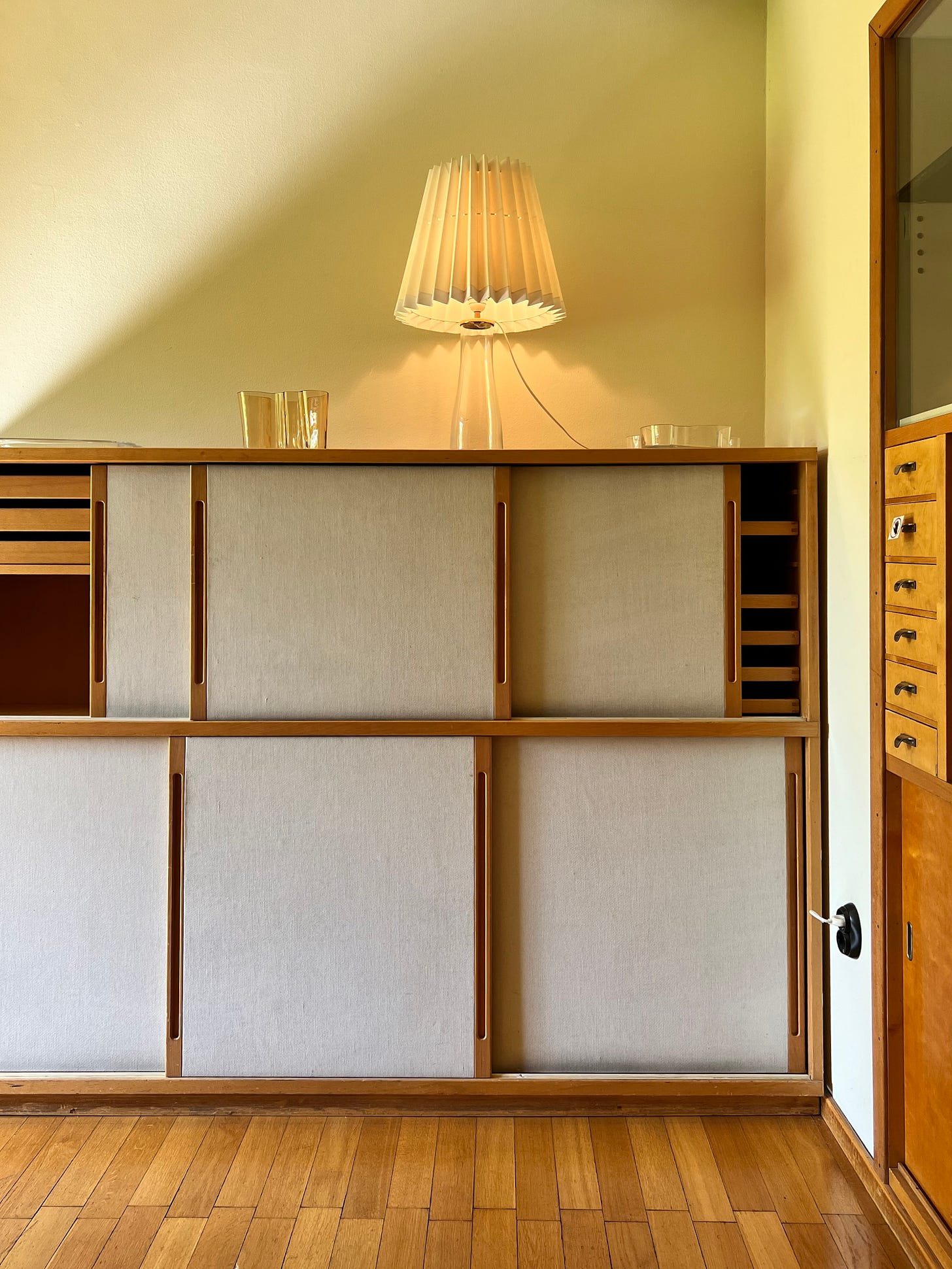
So the reverential awe—which I felt even before entering the Aalto House—hasn’t gone away, really. It’s not just about the idealized image of the romantic and creative partnership behind the name Aalto; it’s also about the particular approach that Alvar and Aino had to modern architecture and design.
Three recent favorites
Addicted to trip-hop ✦ Never too small, never more in love ✦ Judging restaurants by their logo
Addicted to trip-hop ✦
Last year, a friend set me this mix by Hysterical Love Project, and I fell in love with the James K x hoodie track “Scorpio” that appears 25 minutes in—it’s achingly meditative and so, so lovely. After seeing an exceptionally good live set feat. James K earlier this month, I’ve been coming back to the track and appreciating how gentle it is, building up to the ethereal, silky vocals and then letting them subside into a slow beat.
Never too small, never more in love ✦
My favorite genre of contemporary Gesamtkunstwerk is the carefully designed homes on Never Too Small, a YouTube channel devoted to small homes—usually studio or 1-bedroom apartments in cities—and the inventive ways that they handle furniture, hidden storage, and decoration.
One of my favorite recent videos is this gay couple in Tokyo, who DIYed most of their renovation while living there. The use of blue PVC tile, to define the kitchen and dining area within the open floor plan, is a lovely detail that reminds me of the large swaths of color that Alvar and Aino Aalto used in the Paimio Sanatorium:
Judging restaurants by their logo ✦
I’m embarrassed to say that 90% of the reason I wanted to go to Maukku—a restaurant and wine cellar in Helsinki that a friend recommended—was the voluptuous, exuberant Art Nouveau logo and the very cute website:

The logo, with its curved MA ligature (I love the huge curl on the A!) and the lovely UKK (the two K’s joined up together!), was stamped in red ink at the top of the wine list—it felt very informal and cheerful to see the edges of the stamp block, and the red ink layered over the printed Welcome <3 text in black.
And the dinner itself was lovely—I loved the selection of seasonal pickles, served in a silver dessert dish that felt very Gohar World. So the lesson, unfortunately, is that sometimes it’s okay and even rewarding to judge a restaurant by its logo. (If you happen to know who designed it, please let me know—I DMed the restaurant on Instagram but they didn’t get back to me!)

To readers old and new—thank you for being here! I’d love to hear about your S-tier/D-tier design idols; your hot takes on Le Corbusier; and your favorite things to pickle.
In high school, I even kept a list of power couples in design and art:
Charles and Ray Eames (designers)
Massimo and Lella Vignelli (designers)
Paula Scher and Seymour Chwast (designers)
J. Abbott Miller (designer, partner at Pentagram) and Ellen Lupton (design curator, professor and writer)
Georgia O’Keefe and Alfred Stieglitz (photographers)
Roxane Gay (writer) and Debbie Millman (designer and writer)
Rick Owens (fashion designer) and Michèle Lamy (icon)
Jackson Pollock and Lee Krasner (artists)
And former couples:
Marina Abramović and Ulay (performance artists)
John and Faith Hubley (animators)
Raf Simons and Véronique Braquinho (fashion designers)
The other doors at Paimio were just as carefully designed. As Witold Rybczynski notes, the dining hall had push/pull doors with bars made of tubular steel. But the areas that people actually touched were made of ebony—which made for a better tactile experience.
In “Certified Copies: Notes Towards a Theory of the Knockoff,” Erik Anderson writes about his conflicted feelings when buying the cheap knockoff over the expensive “original”:
Take IKEA’s iconic Poäng chair, for instance, the cantilevered wood frame that curves like an S with the top cut off. It’s a lovely chair, and quite comfortable, but it’s a rip-off of a design by the Finnish architect Alvar Aalto, whose lounge chair 406 predates IKEA’s by four decades…I had mixed feelings about buying them, and I hadn’t even learned they were knock-offs yet, although I suspected something of the sort…but the more anonymous chairs I preferred were more expensive, and so my wife’s will and my own cheapness prevailed…
We are willing to privilege cost over integrity, but we prefer that style surrender nothing, or very little, to cost. We are people with some measure of taste, but not nearly enough to see how and when we’re being tasteless. We value pragmatism over originality. We are relentlessly bourgeois, and we know it.
That’s one view of it, anyway. Another would note that Aalto’s chair…borrows liberally from a metal chair designed by Bauhaus member Marcel Breuer a decade earlier. Breuer, in turn, claimed to have been inspired by his bicycle.
I’m exaggerating a bit, but not too much. It really is intimidating to try and participate in a conversation where everyone seems to know these terms and deploy them with total self-assurance—while you’re timidly peering in and feeling like an ignorant little worm. But the solution, I think, isn’t to avoid technical terminology! I remember feeling similarly intimidated by the word historiography, but once you learn the definition, it’s useful to have a convenient, compact way to package up the concept and express it quickly.
Here’s my definition of historiography: The study of how history is written. The historiography of Alvar Aalto, for example, would be studying how Aalto has been understood by historians past and present; what methods and sources and frameworks they used to understand him (e.g. using his architectural plans, abstract paintings, writings; by speaking to his collaborators only, or also his clients and friends and neighbors; by thinking about him through the lens of “modernism” or “Finnish” identity); what was excluded or included in writing about him. How did historians write about his two wives, Aino and Elissa Aalto? How were they written about? How central or peripheral were they to histories of Alvar Aalto, and what does that say about the historians and the time period/sociocultural context they were working in?
This definition, I think, makes a strong case for teaching children (and adults, frankly) about historiography—in order to make people more critical consumers of media. It’s a core skill for promoting media literacy!
Vernacular architecture is another one of those terms that I am constantly googling to make sure I understand what it is. Here’s my definition: Buildings that are not designed by professional architects (and are often designed by people whose names have been forgotten over the years), typically informed by the design conventions around them—as well as the materials locally available. Anything that might be called a traditional or indigenous dwelling for a particular area—that’s likely vernacular architecture.
Sometimes, the term is also used for buildings that are designed by professional architects, but nevertheless conform to a certain design norms for the area.
You may have noticed that I omitted taste from the list of the Aalto House’s qualities. I actually think this is something architects can’t really offer to people…beyond designing a usefully ergonomic and well-equipped kitchen, so that residents can offer a delicious experience to each other and their guests!





I totally relate to the foreign feeling when hearing terms like critical regionalism and vernacular architecture - I never felt like there was a standard set of definitions for some of them and instead they felt like elusive concepts that only professors and starchitects understood.
And speaking of starchitects, I agree that Aalto is one of the few that I give allowances for. I think that he’s the last in an era that was so focused on the removal of ornamentation and a shift towards modernism, but still designed for emotional movement. And I can respect that.
here's a post about the Maukku logo & custom typeface! -- https://www.instagram.com/p/C-K4NCBN7Tq/ and https://aleksitammi.com/fonts/kumquat